25 Referral Button Copy Ideas That Actually Convert in 2026
Your referral program‘s success hinges on five words or fewer—the exact copy on that button determines whether customers click to share or scroll right past. Most Shopify stores lose thousands in potential referrals simply because their CTA says “Refer a Friend” instead of something that actually motivates action.
This guide breaks down 25 proven referral button copy examples you can steal right now, plus the psychology behind why certain phrases convert 2-3x better than generic alternatives. You’ll also learn the design, placement, and testing strategies that turn those clicks into actual shares and sales for your store.
>> You may also like:
- Customer Referral Strategy Guide: How to Grow Your Shopify Store in 2026
- How to Ask Clients for Referrals: 50 Proven Tips for Shopify Merchants
- 60+ Referral Program Examples You Can Copy 2026 (By Industry)
What Is a Referral Button CTA and Why It Matters
A referral call-to-action (CTA) is a clickable button that prompts your existing customers to recommend your store to friends, typically offering rewards to both parties. Unlike regular purchase buttons that focus on buying, referral CTAs emphasize sharing and advocacy, turning your customer base into a growth engine. The copy on these buttons—the actual words customers read—directly shapes whether they’ll click or scroll past.
Getting this copy right makes a massive difference. Well-crafted referral button text can convert 2-3x more visitors into active advocates compared to generic “refer a friend” buttons. When customers immediately understand the benefit through clear copy, they’re far more likely to take action right then and there, rather than putting it off indefinitely.
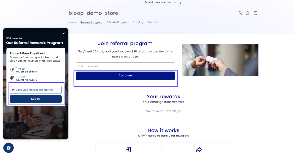
For Shopify stores, these buttons pop up everywhere: post-purchase pages, email campaigns, account dashboards, and checkout confirmations. That makes your referral CTA widget one of your most visible marketing touchpoints, so the words you choose really matter.
How Referral CTA Copy Drives More Shares and Sales
People share products they love when they know both parties benefit—it’s basic reciprocity psychology. Button copy that explicitly states the reward structure, like “Give $10, Get $10,” removes any guesswork and creates a win-win scenario that feels generous rather than salesy. This clarity builds trust and reduces the mental friction that stops most customers from completing referral actions.
Great referral copy also taps into emotional triggers. Phrases positioning sharing as “unlocking” benefits or “joining” something special make customers feel like insiders spreading valuable knowledge. The language you choose directly impacts click-through rates, with action-oriented, first-person copy consistently outperforming generic alternatives.
Studies show referral programs with clear, benefit-driven CTAs can reduce customer acquisition costs by 30-50% compared to traditional advertising. Even better, referred customers typically have 16% higher lifetime value because they arrive through trusted recommendations rather than cold ads.
Quick Rules for Writing Referral Call to Action Copy
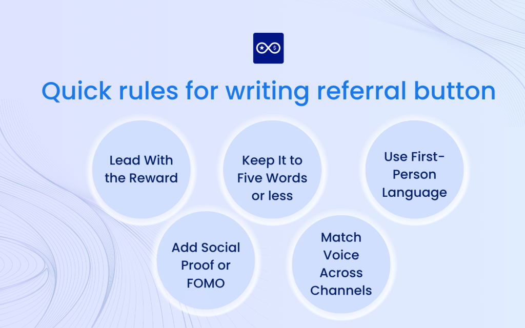
1. Lead With the Reward
Starting your button copy with the benefit immediately answers “what’s in it for me?” before customers scroll away. “Earn $20” or “Get Free Shipping” placed at the beginning creates instant clarity about the value proposition. Our brains process rewards first when scanning content, making benefit-forward copy more memorable and clickable.
2. Keep It to Five Words or Fewer
Brevity keeps your button text scannable on mobile devices where most customers shop. Concise CTAs like “Share & Save 15%” communicate the full message without overwhelming readers or getting cut off on smaller screens. Ruthlessly editing down to essential words forces you to focus on the core benefit, naturally improving clarity.
3. Use First-Person Language
Writing from the user’s perspective with “I,” “My,” or “Me” creates personal ownership of the action. “Claim My Discount” outperforms “Claim Your Discount” because it positions the reader as already having the reward, just needing to take one step. This subtle shift taps into psychological ownership, making the action feel more natural and less like following instructions.
4. Add Social Proof or FOMO
Including urgency words like “Today,” “Now,” or “Limited” encourages immediate action by suggesting the opportunity might not last. Social validation phrases such as “Join 10,000+ Referrers” leverage the bandwagon effect, showing customers that others are already benefiting. Together, these elements overcome procrastination, which kills most referral opportunities even when customers have good intentions.
5. Match Voice Across Channels
Maintaining consistent brand tone whether your button appears in emails, pop-ups, or account pages builds recognition and trust. If your brand voice is playful, “Hook Up a Friend” works everywhere; if you’re more professional, stick with “Share Your Exclusive Offer” across all touchpoints. Consistency reduces confusion—customers recognize your referral program instantly regardless of where they encounter it.
25 Referral Button Copy Ideas That Actually Convert
These proven examples span different industries, reward structures, and brand voices, giving you ready-to-use copy you can adapt for your Shopify store right now.
Simple & Direct:
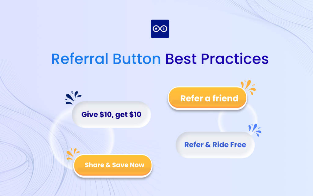
- Get $10 Give $10: This classic dual-benefit format immediately shows equal value for both parties, eliminating any perception that the program favors one side.
- Share & Save Now: Combines the action with an immediate benefit and urgency word to drive quick decisions without feeling pushy.
- Invite a Friend Score Cash: Direct cash incentives with casual, friendly tone remove barriers and speak plainly about the financial benefit.
- Pass It On Pocket $5: Simple, rhyming copy with clear cash reward makes the action feel effortless and the benefit concrete.
- Refer Today Enjoy Free Shipping: Immediate action paired with practical shipping benefit removes a common purchase barrier.
Benefit-Focused:
- Unlock Your Friend Discount: Creates exclusivity while positioning the referrer as helpful rather than salesy, increasing sharing motivation.
- Claim Your VIP Perk: Leverages exclusivity and premium positioning to make customers feel special for participating.
- Help a Pal Get Perks: Positions sharing as helping rather than selling, removing guilt and making the action feel altruistic.
- Send the Love Earn Rewards: Emotional appeal softens the commercial aspect while clearly stating the tangible benefit.
- Spread Joy Earn Points: Emotional benefit paired with tangible reward appeals to customers who value both feeling good and practical gains.
Product-Specific:
- Give Shoes Get Shoes: Product-specific copy that rhymes becomes memorable and clearly communicates what both parties receive.
- Send Coffee Get Coffee: Food and beverage copy with reciprocal benefit makes the exchange crystal clear and product-focused.
- Share Style Save 20%: Fashion-focused language with a specific discount percentage removes ambiguity about the reward value.
- Share the Glow Save 15%: Beauty industry copy with emotional and financial appeal combines aspiration with practical savings.
- Spread the Fit Earn Gear: Fitness industry copy with relevant reward speaks directly to active customers who value workout equipment.
Casual & Fun:
- Hook Up a Friend: Casual, conversational tone feels natural and reduces the “salesy” barrier many customers feel about referrals.
- Bring a Buddy Score Swag: Fun, energetic copy with desirable reward creates excitement around the referral action.
- Tag a Friend Unlock Gift: Social media focused copy with mystery gift appeal creates curiosity about what the reward might be.
- Invite & Delight: Simple, positive copy focusing on the joy of sharing removes commercial pressure entirely.
Value-Driven:
- Gift a Month On Us: Subscription service copy emphasizing the gift aspect positions sharing as giving rather than selling.
- Pay It Forward Earn Credit: Appeals to altruism while offering tangible benefit, creating a feel-good action with practical rewards.
- Tell a Friend Plant Trees: Environmental impact combined with social sharing appeals to eco-conscious customers who want their actions to matter.
- Share the Scoop Get Cash: Information or news industry copy with direct monetary reward positions sharing as spreading valuable knowledge.
Industry-Specific:
- Refer & Ride Free: Transportation and service industry focused copy with clear benefit makes the value proposition immediately obvious.
- Share Magic Earn Miles: Travel industry copy with loyalty program integration appeals to frequent travelers who value points.
Each of these examples balances clarity with motivation, making the sharing action feel natural and rewarding for your specific audience.
Design and Placement Tips That Amplify Your CTA
Even the best copy falls flat if customers can’t find or easily click your referral button. Strategic placement matters just as much as the words themselves.
Visibility tactics that work:
- Contrast color that matches brand accent: Use colors that stand out while maintaining brand consistency—your referral button becomes the second-most prominent CTA on any page after the primary purchase action.
- Above-the-fold widget on mobile: Buttons visible without scrolling capture attention immediately, especially since 70-80% of Shopify traffic comes from phones.
- Post-purchase pop-up timing: Show your referral CTA within 5-10 seconds after checkout confirmation when customers feel most satisfied and excited about their purchase.
A sticky banner or prominent card at the top of your account dashboard keeps referrals top-of-mind without requiring customers to hunt for the program. Post-purchase referral prompts convert 3-5x better than random placements because you’re catching people at their happiest moment.
Persistent visibility in customer dashboard areas ensures every login becomes a referral opportunity without being intrusive. A fixed footer bar with your referral CTA stays visible as customers browse their order history or account settings, capturing attention during natural pauses. One-click share buttons beside your copy—like pre-populated messages or instant social buttons—dramatically increase completion rates because customers don’t face a multi-step process.
A/B-Testing Your Referral Button for Continuous Wins
Systematic testing reveals what actually resonates with your specific audience rather than relying on generic best practices that might not fit your brand.
Testing fundamentals:
- Pick one variable at a time: Testing copy, color, or placement individually ensures you know exactly what caused performance changes.
- Run until 95% significance: Most referral programs need 2-4 weeks of testing to reach significance, depending on your traffic volume and conversion rates.
- Track click-to-share rate: Focus on the percentage of button clicks that result in actual shares—this metric reveals true effectiveness.
If you change three elements simultaneously and see improvement, you won’t know which change drove results or if one actually hurt performance while another compensated. A button might get lots of clicks, but if the subsequent sharing flow loses people, you’ve identified a different problem than poor copy.
Continuous optimization means treating each winning variation as your new baseline, then testing another element to compound improvements. The best referral programs evolve quarterly, with brands seeing 20-40% cumulative improvement over a year of consistent testing. Start your testing with the highest-traffic placement first, like your post-purchase page, where you’ll reach statistical significance fastest and see the biggest impact from improvements.
Common Referral CTA Mistakes to Avoid
Even experienced marketers stumble into predictable pitfalls that quietly drain referral program performance.
Frequent errors to watch for:
- Burying the reward: Hiding benefits in fine print or secondary text forces customers to work for information they deserve instantly—your button copy or the text immediately surrounding it (within 10 words) can explicitly state what both parties receive.
- Wordy or vague copy: Buttons with seven-plus words or generic phrases like “Learn More” or “Refer Friends” fail to communicate clear value, making customers scroll past.
- Inconsistent incentive message: When your button promises “$20 credit” but the landing page reveals it’s actually “up to $20 after three referrals,” you’ve broken trust and wasted a click.
- Forgetting mobile view: Testing button appearance and functionality on actual phones catches issues like truncated text, tiny tap targets, or awkward placement that desktop testing misses.
If your CTA requires customers to click just to understand what they’ll get, you’ve already lost most of them to competing distractions. This mismatch between expectation and reality tanks conversion rates and damages your brand’s credibility, often causing customers to abandon your entire referral program. Since most shares happen on phones, a button that looks perfect on desktop but gets cut off to “Get $1…” on mobile essentially doesn’t exist for your primary audience.
Turn Clicks Into Customers With Bloop’s One-Click Setup
Creating effective referral button copy matters most when you have a reliable system to track, reward, and manage the referrals that flow from those clicks. Bloop’s referral platform for Shopify lets you customize your button copy, test different variations, and automatically track every share and conversion without technical complexity.
The platform includes pre-built button templates based on proven high-converters, though you can easily customize the exact wording to match your brand voice and reward structure. Bloop handles all the backend tracking, so when customers click your carefully crafted CTA and share with friends, you’ll see real-time data on clicks, conversions, and rewards earned. With fraud prevention built in and seamless Shopify integration, you can focus on crafting compelling copy while Bloop manages the technical details of running a successful referral program.
Over 2,000 Shopify merchants trust Bloop to turn their best customers into effective advocates, and you can start with a free trial to test your button copy ideas risk-free.
FAQs About Referral CTA Buttons
How many referral buttons should appear on a single page?
Limiting to one primary referral CTA per page avoids choice paralysis and maintains focus on the main conversion goal, though you can repeat the same button in different locations like header and footer. Multiple competing referral offers on one page typically reduce overall click-through rates by 40-50% as customers feel overwhelmed rather than motivated.
Does referral button color matter more than the copy text?
Copy text drives the initial decision to click by communicating value, while color ensures the button gets noticed in the first place. Think of color as getting attention and copy as converting that attention into action—you need both working together, with testing often revealing that a 10% improvement in copy outweighs a 5% color change for most brands.

Hien Tran
Hien Tran is a Product Marketing specialist at Bloop, where she translates product features into growth-driven solutions for Shopify merchants. By combining market insights with clear messaging, Hien ensures that store owners not only understand Bloop’s value but also know how to apply it to boost revenue, loyalty, and customer acquisition.